Slack.com Redesign
In August 2017, I led the launch of a redesigned Slack.com with a new backend that loads pages faster and a new modular design system to quickly and efficiently build landing pages. I subsequently led the translation of the site into French, Spanish and German as well as the localization of Slack.com into Japanese.
Old Slack.com - January 2017
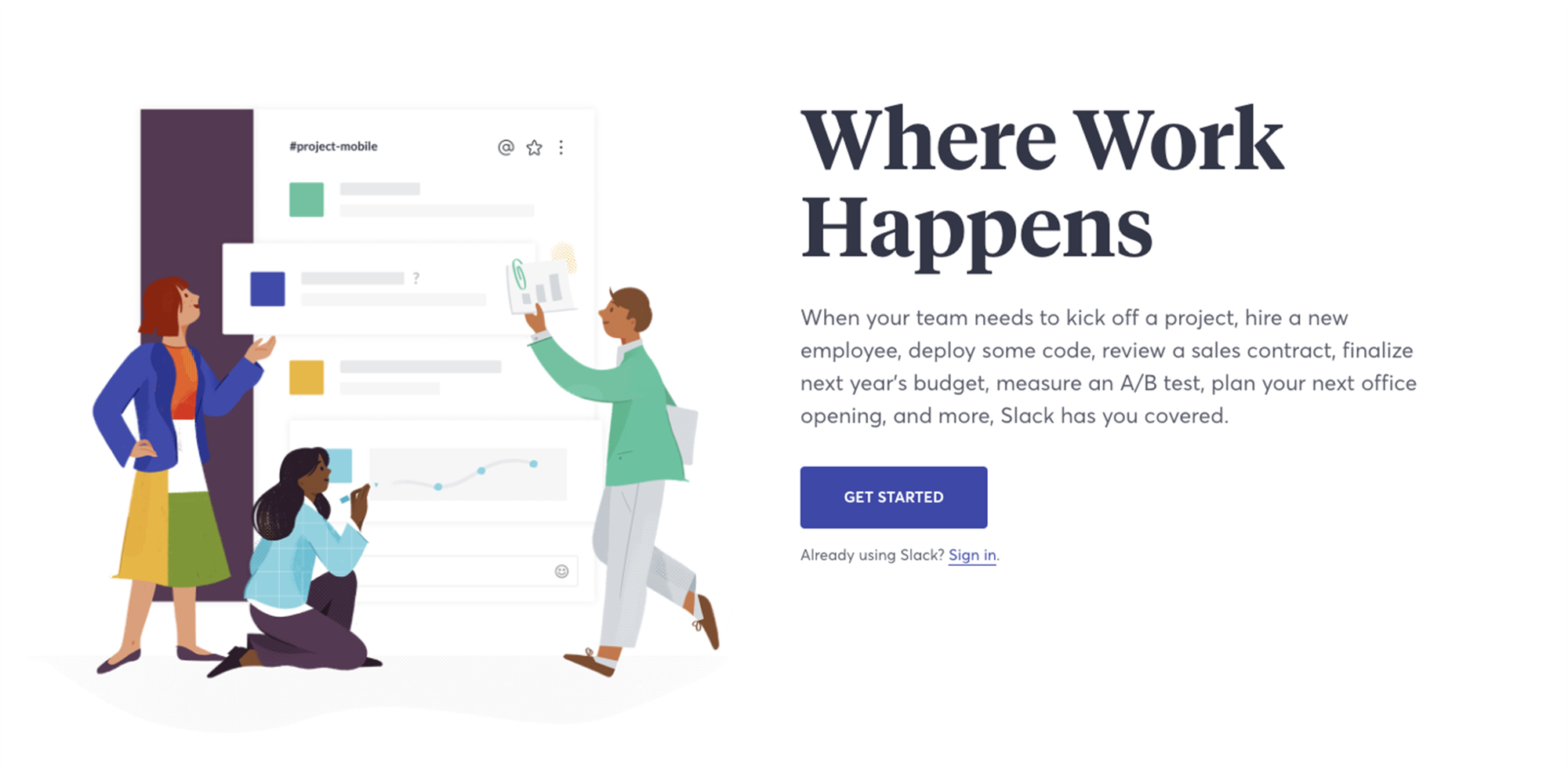
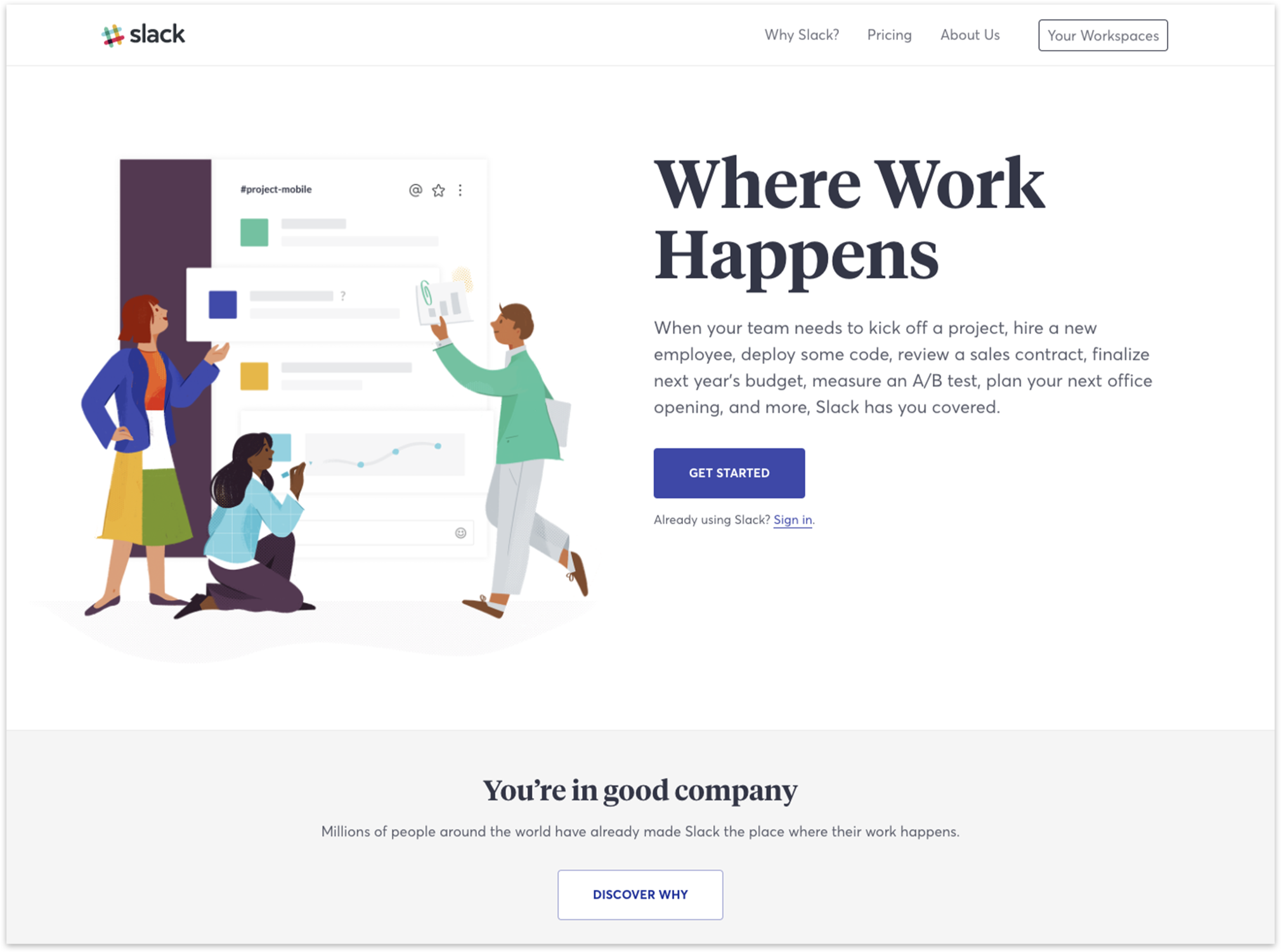
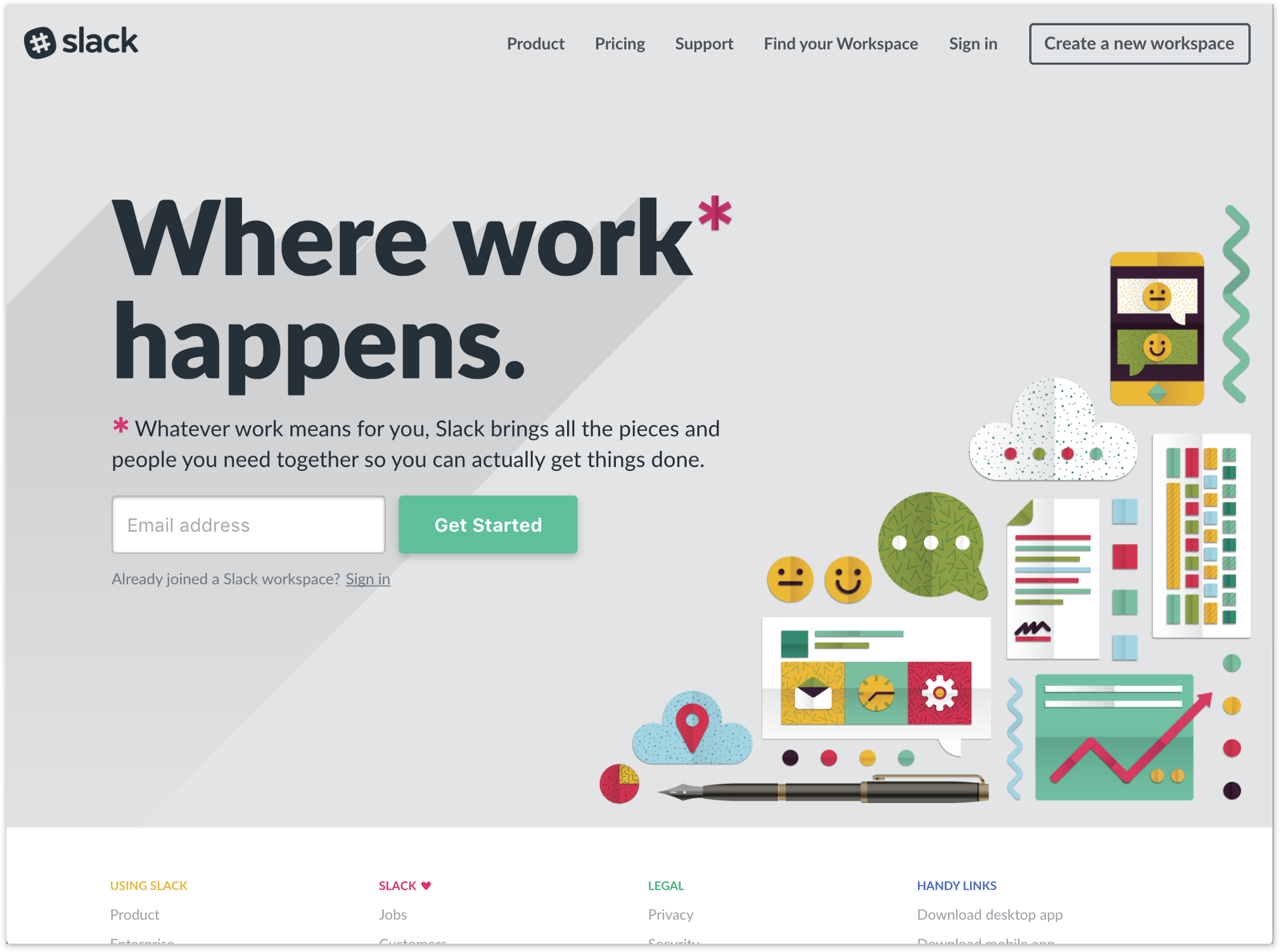
Above is Slack’s previous homepage. I worked with the design agency UENO and the illustrator Alice Lee to create a simpler, cleaner and more responsive design that you can see below.
User Flows - August 2017
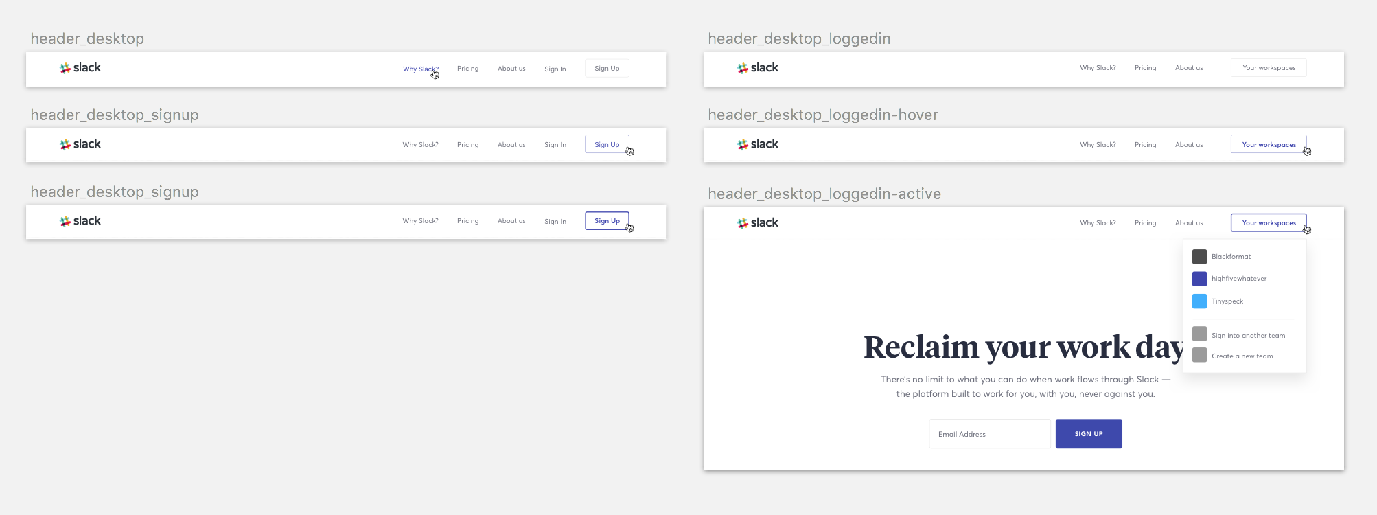
I worked closely with the Customer Acquisition and Engineering teams to simplify user flows across for the redesign. Here is an example of how we looked at the primary navigation as a user flow...
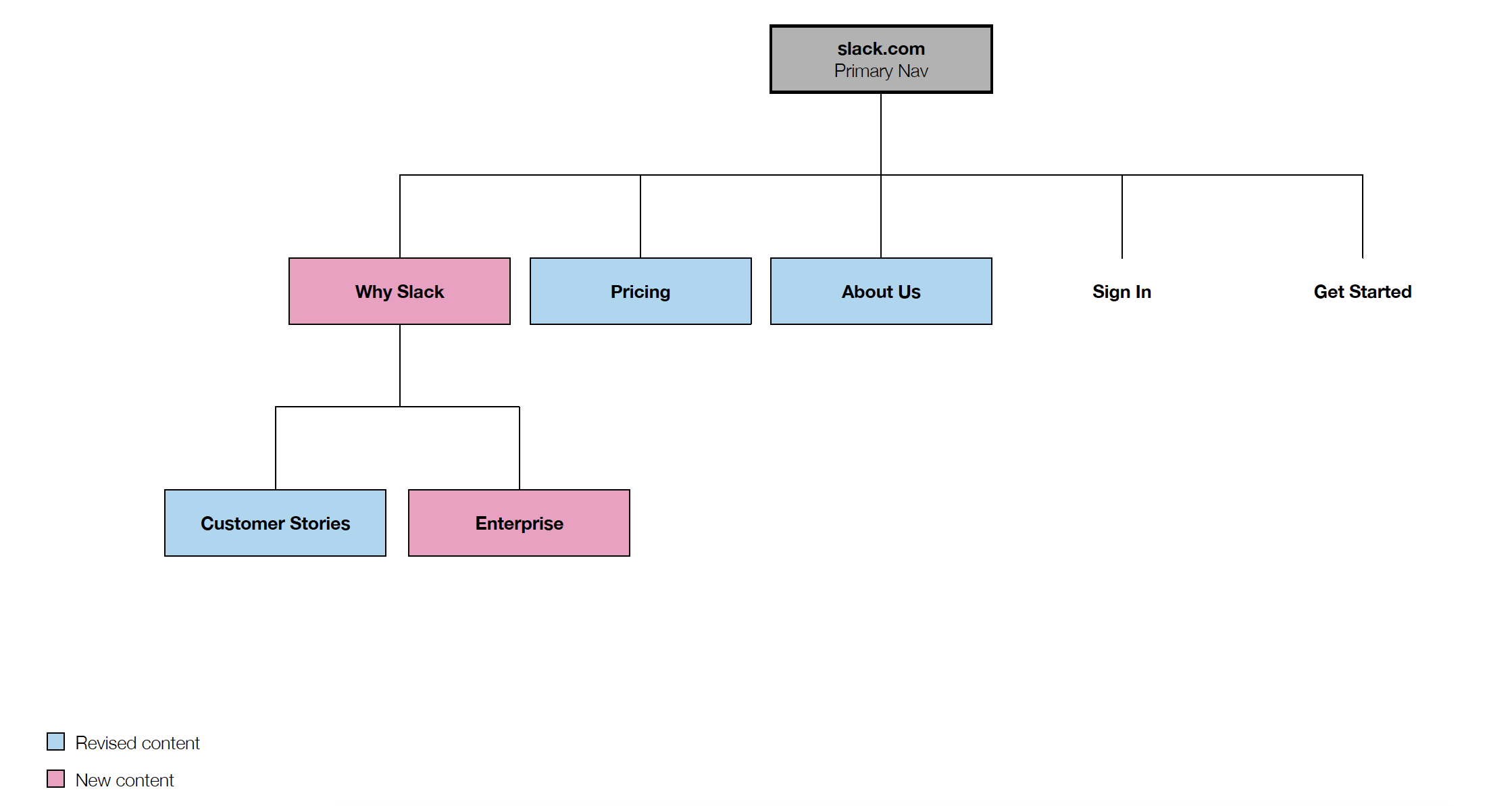
...and then visually designed it.
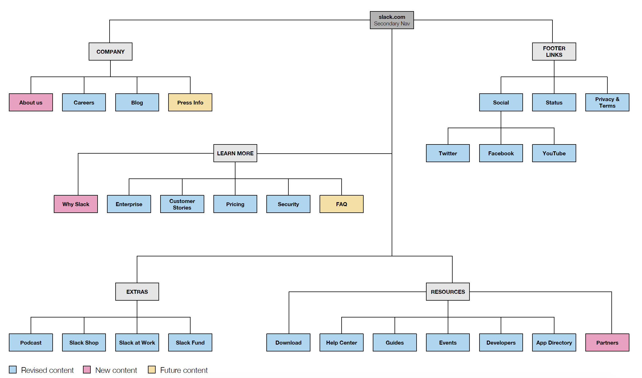
Below is another sample user flow of some how we wanted potential customers to move through our secondary navigation and footer.
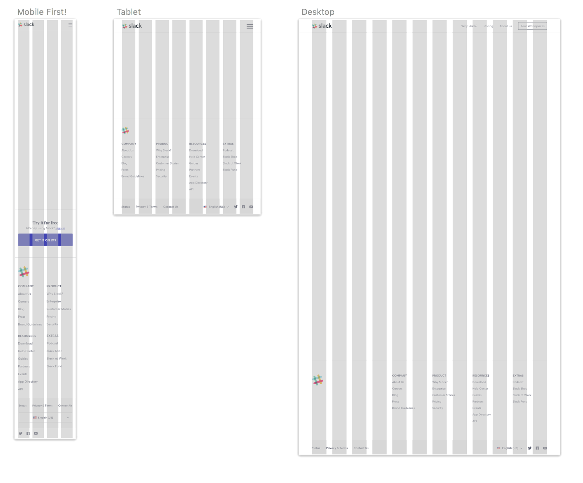
The New Grid - August 2017
I led our web design team to create a grid kit with an emphasis on mobile first designs as a base for designing new landing pages.
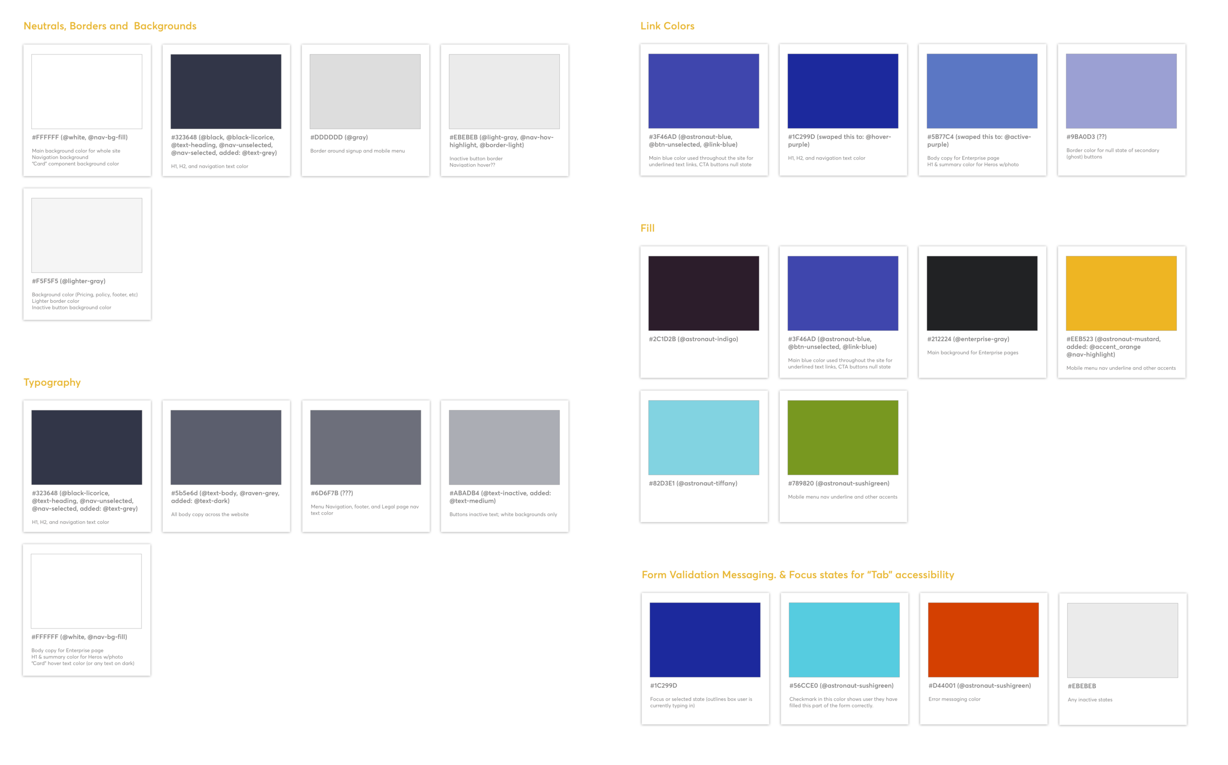
Updated Color Palette - August 2017
At the beginning of the design process Slack had too many duplicative web colors so I created a more intentional and simpler palette with an emphasis on accessibility.
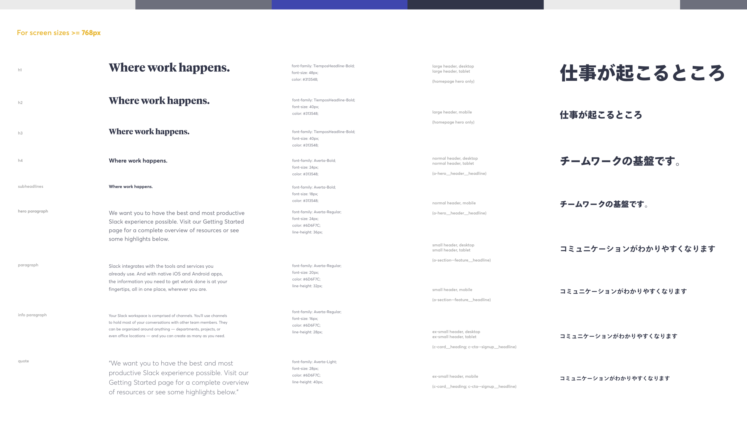
Typography guide - August 2017
I wanted to create a responsive type system using Tiempos and Averta typefaces that could naturally scale with our website. The sizing and weights I developed are based on our grid and breakpoints.
For Japanese, I decided to use Tazugane Gothic's weights exclusively to represent the language's character's clearly. See a sample of Slack.com's type stack in English and Japanese below.
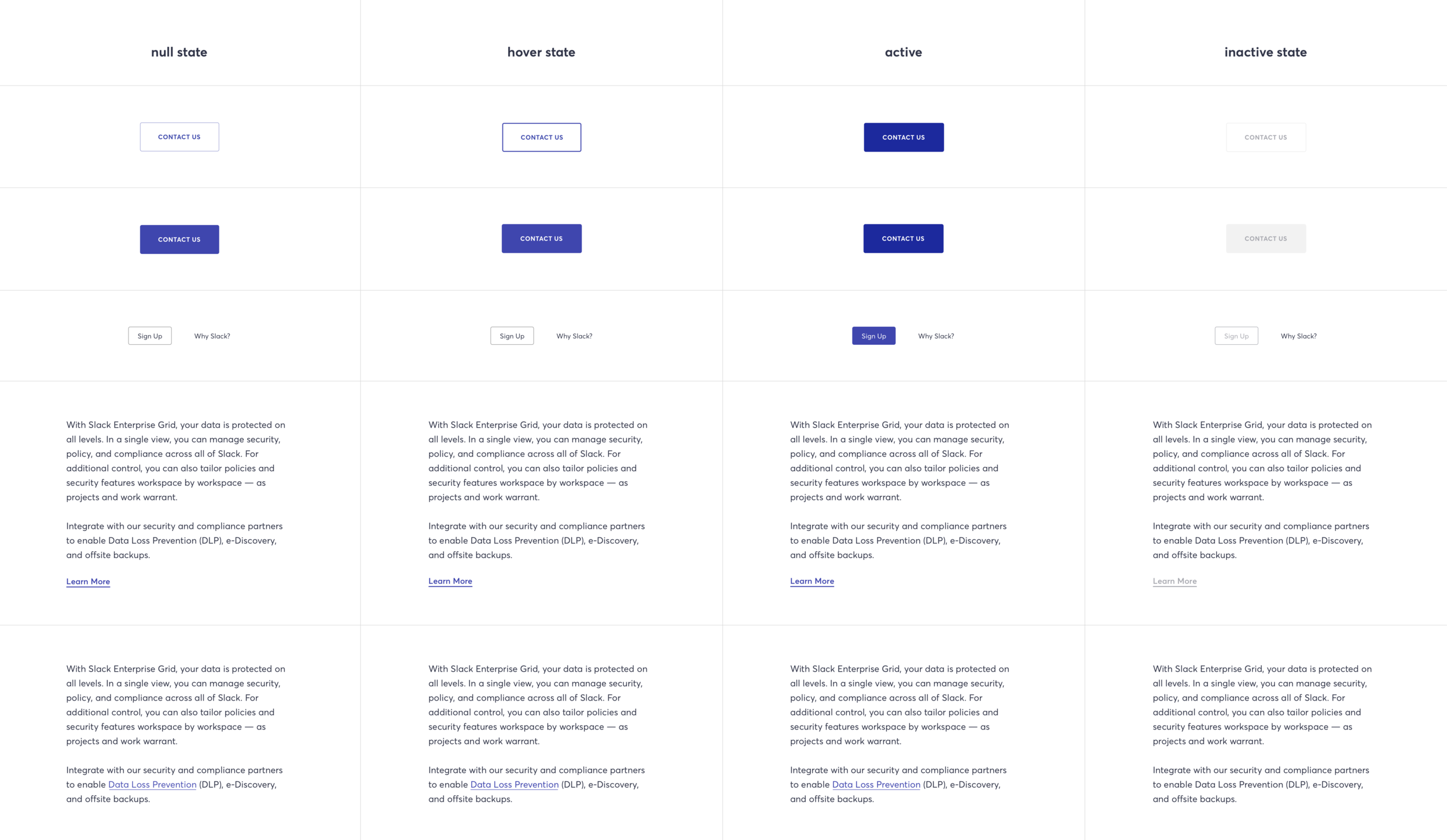
Button Styling - August 2017
I wanted to make sure that the UI for buttons and labels would work universally across the site, so I worked with a junior designer on the web team to create a guide for all of the functional states.
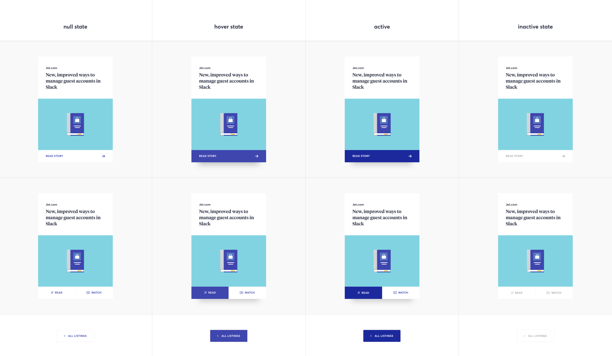
Card Component - August 2017
We also designed states for our card UI to be used across various devices and considered how user experience would be affected on touch devices as opposed to those with a mouse or touchpad.
Patterns & Textures - August 2017
In oder to create more visual interest on our mostly white pages, I worked with a junior designer to create a pattern system that follows accessibility principles and balances our illustrations.
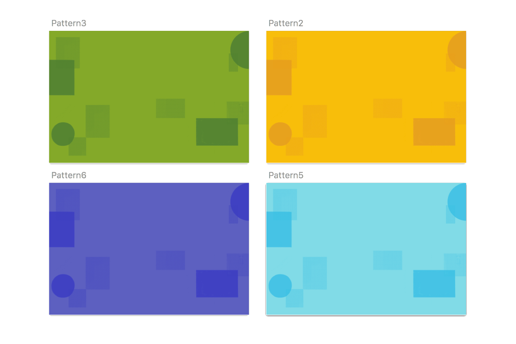
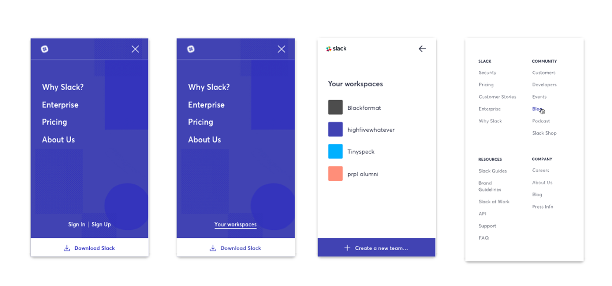
These patterns were developed into the background for Slack.com's mobile menu as well as the hero background for download the Slack app landing pages.
Landing Pages - August 2017
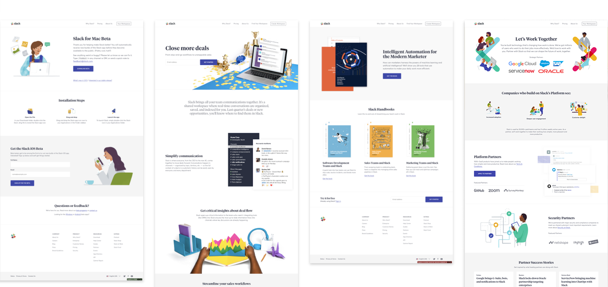
Since developing this visual system for the redesigned Slack.com we have been able to produce these various types of landing pages covering a range of content areas and audiences.
