Solutions Landing Pages
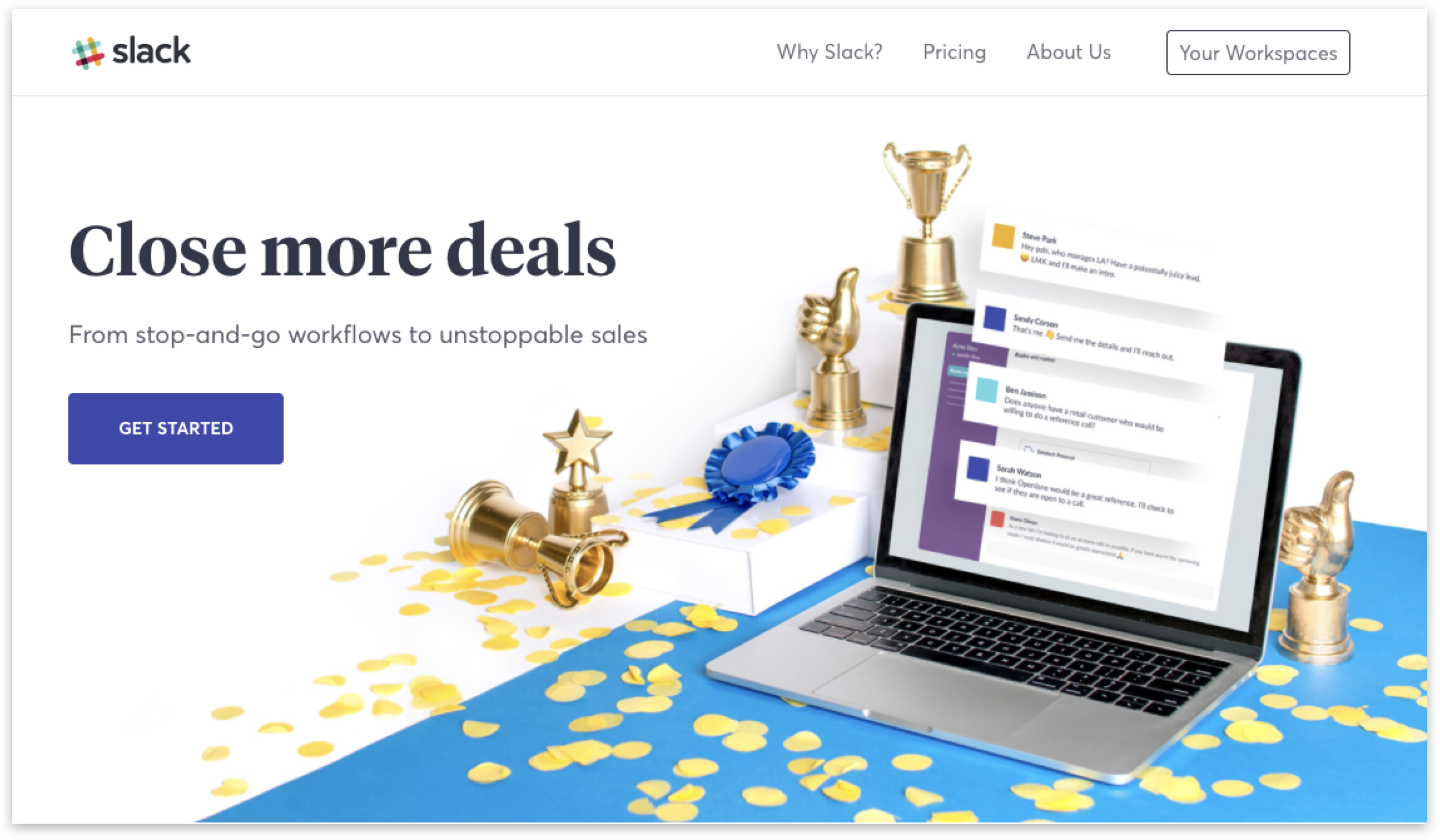
At Slack, I teamed up with Christopher Reath, communications designer, to re-imagine our role-based (Sales, Marketing, Engineering) landing pages. The Sales Solutions landing page was the first one to go live on the website.
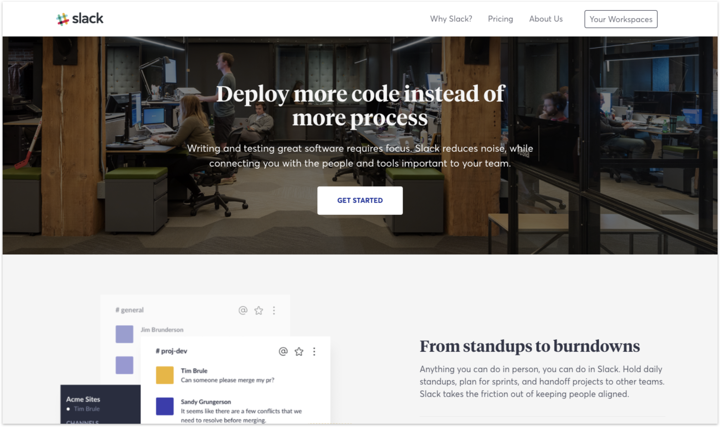
Previous Design - August 2017
The soon to be updated Engineering Solutions page, below, is a perfect reference point for how these landing pages looked before. The hero area was dark and uninspiring while the overall page felt too product heavy.
Competitive Analysis - November 2017
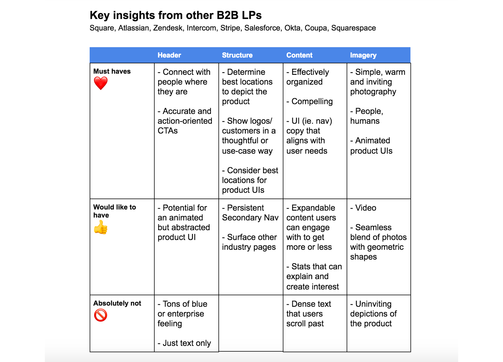
In order to better understand our stakeholders's needs, I conducted a competitive analysis exercise where we evaluated our competitors' similar role-based pages. I analyzed and compiled the data into a Google document to highlight the following insights.
Wireframing - November 2017
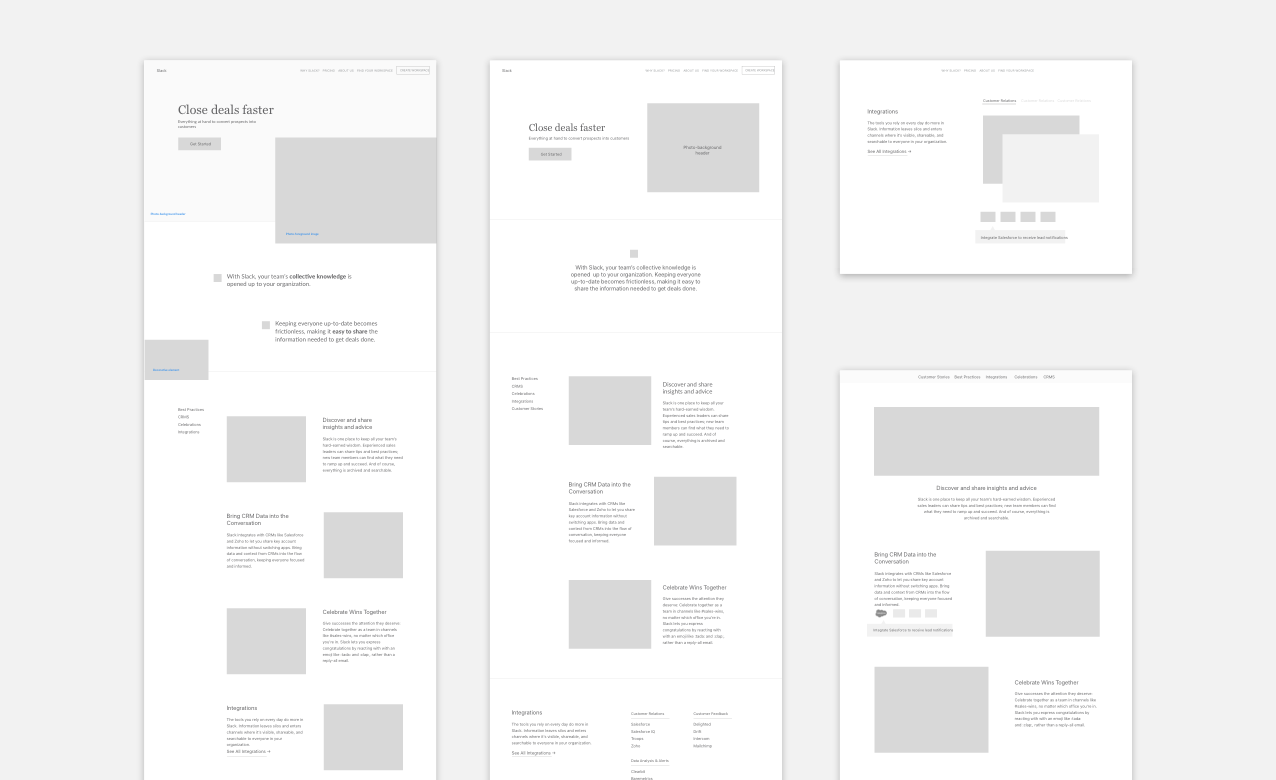
I worked with the same designer to create some rough wireframes of what the new infrastructure of the solutions pages could be while using a mix of existing components and creating a few new ones.
We focused on alternating imagery with product UIs and finding a layout structure that utilizes white space for breathable, easy to navigate designs.
Imagery Brainstorm - November 2017
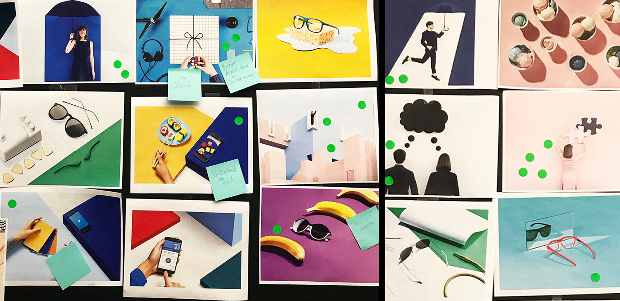
We held a brainstorming session with the whole design team to decide on a photography style since the previous exercise highlighted a need for warm, inviting and human images on the website.
Concepting - December 2017
Once the photography style was selected, I facilitated a quick concepting session for us to come up with ideas for how to depict the Sales professional role in the hero and throughout the page. We worked closely with copy to ensure our ideas worked hand in hand.
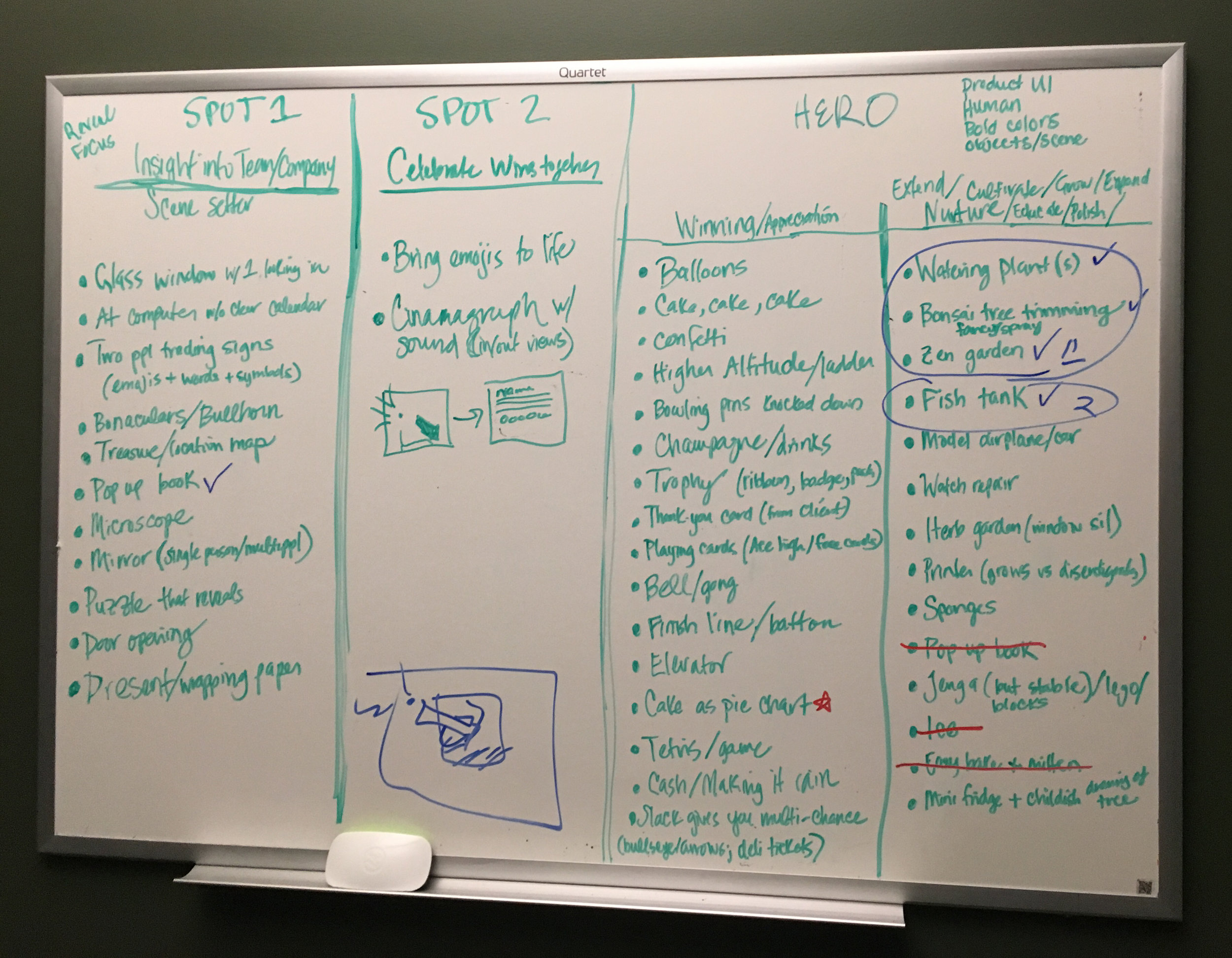
Photo Shoot - December 2017
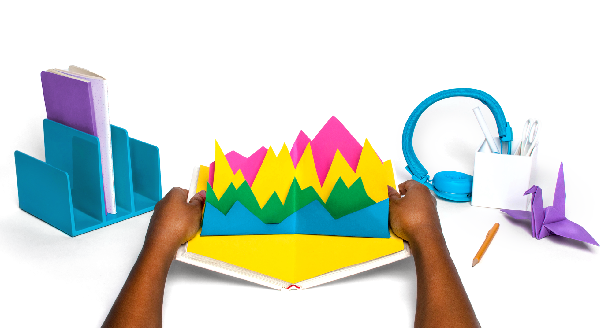
Below are a sampling of the images we produced based on our shot list and the items we were able to purchase from Crate and Barrel and Amazon. I managed the 3 day shoot with our in-house photographer and designer, Russell Shaw.

Product UIs - December 2017
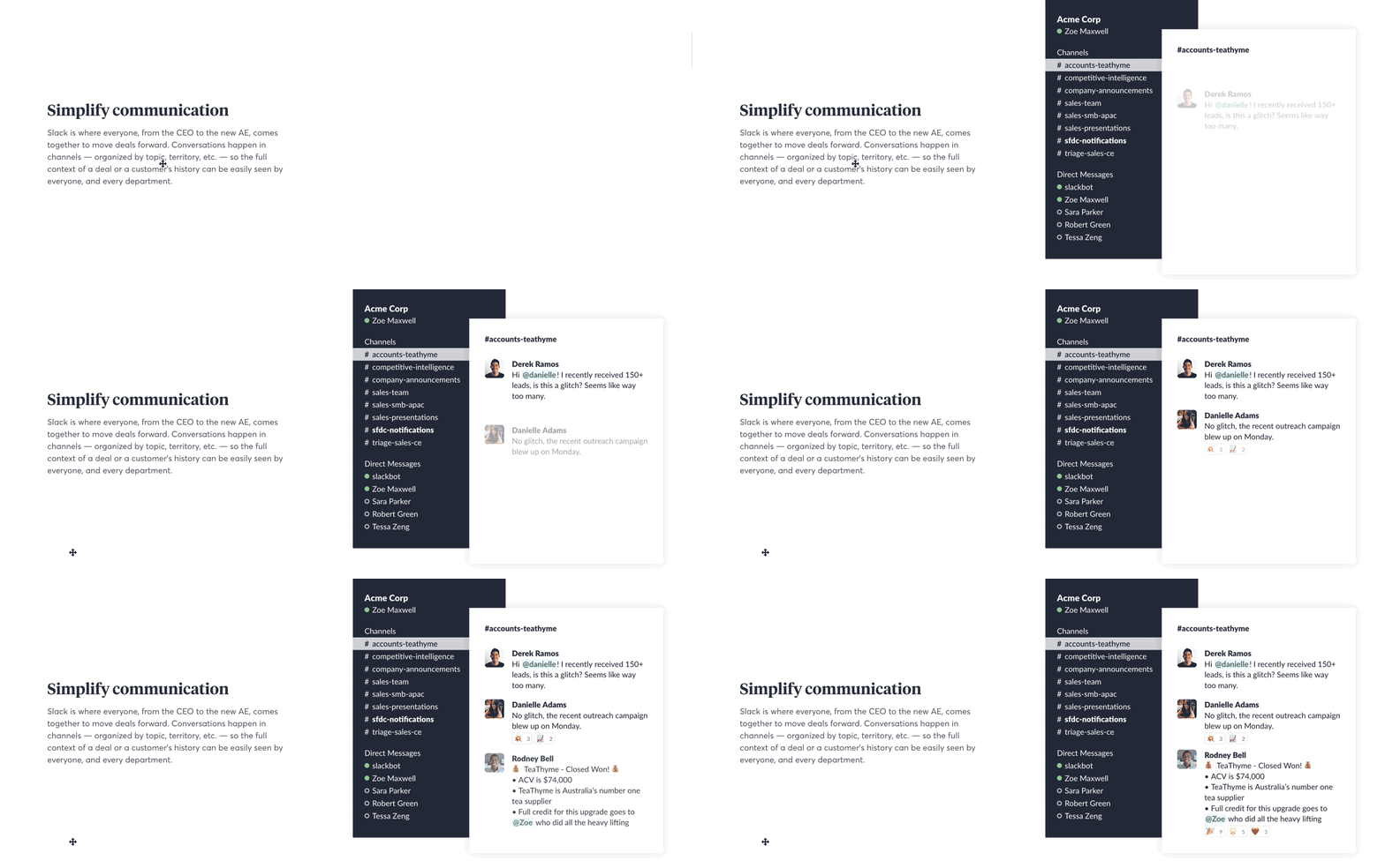
After the decided which art to move forward with, I tackled our second most important insight: animated product UIs to better explain Slack's interface to prospective Sales professionals.
I was able to bring in Issara Willenskomer to do a two day workshop on motion design for our design team in order to create the animations you see below.
Final Page Comparison
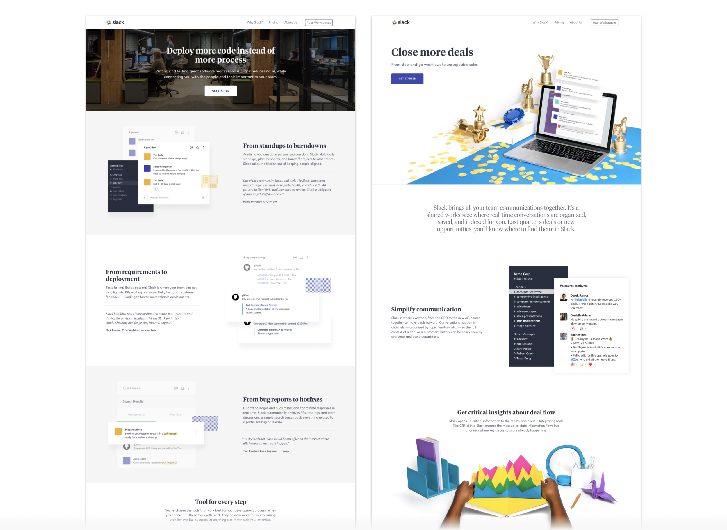
Now you can evaluate the two pages side by side to see which one fits into the Slack brand and website more effectively. And if users are better able to digest the content both at a glance and with contextual comprehension.
